Coming from an artistic family, I fondly remember frequently carrying around a sketchpad in my youth. When I was introduced to the Mac, applications like Kid Pix and Dabbler opened up my eyes to the world of digital artistry. When I discovered I could edit system icons using ResEdit, my mind was blown! This lead me to many marathon pixel pushing sessions where I’d defile the default icons of my family’s Macintosh IIcx.

Later, this lead to the discovery of a little app called Icon Machine, which I likely grabbed from a MacAddict magazine CD and put on the family’s hand-me-down Power Macintosh 7100. Icon Machine is a purpose-built application that let you more easily edit or create icons for your Mac. It made it easier for a young me to go wild with my own crazy icon creations. Most of which are (thankfully) likely lost to time.

Ages later, when Mac OS X debuted, I recall icon editing got way fancier, with updated icon editing apps that better integrated with graphic programs like Adobe Photoshop, which made sense now that icons were bigger, more beautiful and offered alpha channels. I recall making a few replacement icons for some apps, but since these icons were larger and more complex, they took more time to craft.
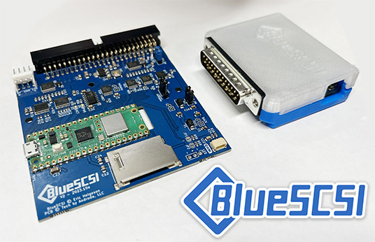
Recently, I was talking to Eric Helgeson, the founder of the BlueSCSI project. If you’re unfamiliar, the BlueSCSI is an open-source hardware solution that lets you replace your vintage computer’s old SCSI hard drive (or CD, Zip, etc) with an elegant SD card based solution. When the BlueSCSI v2 debuted, I made a video all about it, and since then I’ve purchased a bunch of them to help keep my old Macs going.
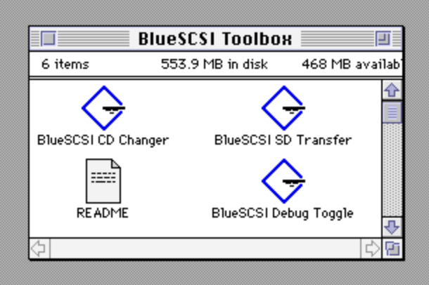
One of my favorite features of the BlueSCSI is their toolbox application suite. These are mini applications that are designed to help you transfer files, switch between virtual CD images, and toggle debug mode, etc.
I’ve been using these apps for years and enjoyed them. One day I asked Eric a question, something along the lines of: “Why are all the icons for these apps the same?”.
His reply was simple, “Make me some new ones?”. So I just volunteered myself to revisit my youth and create some fresh icons for apps I enjoyed using… but where to begin?
For me, it usually beings with pencil and paper. I had a bunch of ideas, but soon realized a lot of them would not visually translate well to the 32×32 pixel arrangement of these icons, which would normally be displayed on small screens, low resolutions, etc. Some of my more creative designs probably wouldn’t look so good, or wouldn’t translate the concept of the app. After all, what good is a pretty icon if it doesn’t tell the user what they need to know about the app or the functionality of it?
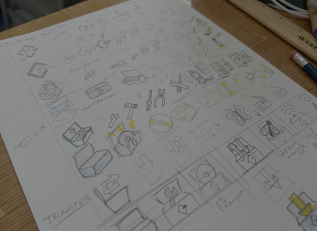
After spending an afternoon doodling down some ideas as they came to me, I settled on the visual of using a toolbox with a small SCSI logo on the front. I could then change what was inside of the toolbox for the specific app. This not only lent itself to the BlueSCSI toolbox suite of apps, but also ensured these icons were consistent and made them feel like they belonged to a family of apps.
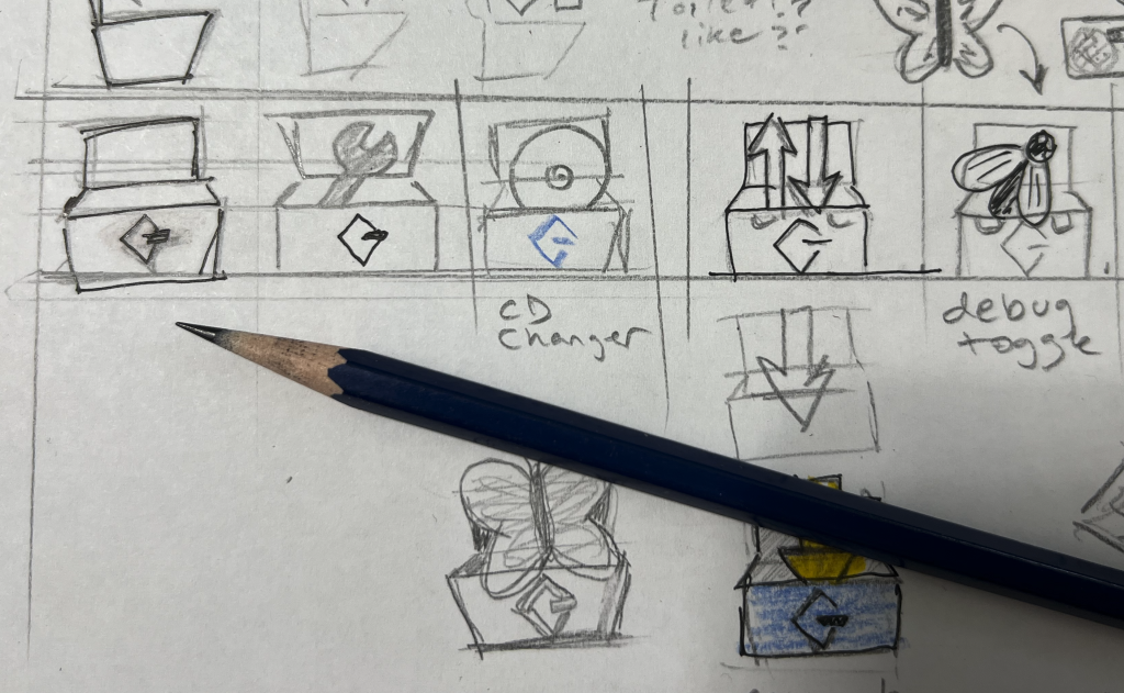
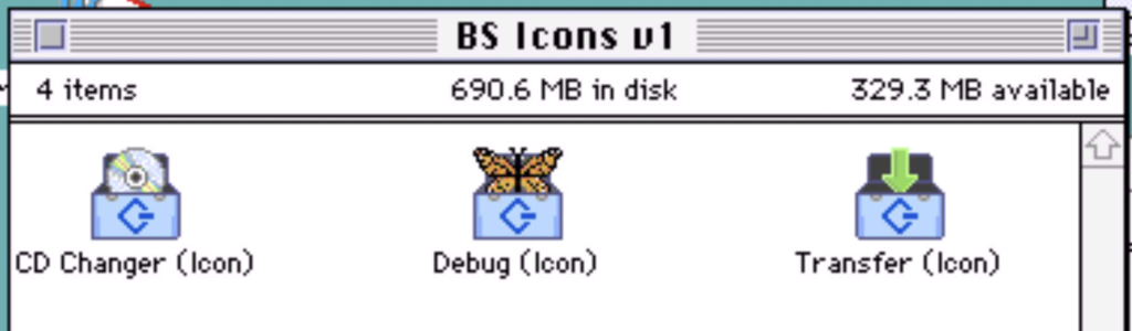
I settled on the following designs: an arrow for the toolbox to show data being transferred, a shiny CD-ROM to demonstrate the mounting or changing of CDs, and a butterfly to visualize the ability to enable or disable the debug mode of the BlueSCSI.
Icon Machine was great and all but I was curious if another pixel-centered app would work – Aseprite. I bought this lovely little app ages ago via a recommendation of a friend. It not only let you draw beautiful pixelated masterpieces, but it let you animate it too! Suddenly it was like if someone combined Dabbler with Icon Machine. I was smitten for days, spending hours creating fun little animated images, for no reason other than to revisit my youth and enjoy the art of inserting life into still images.

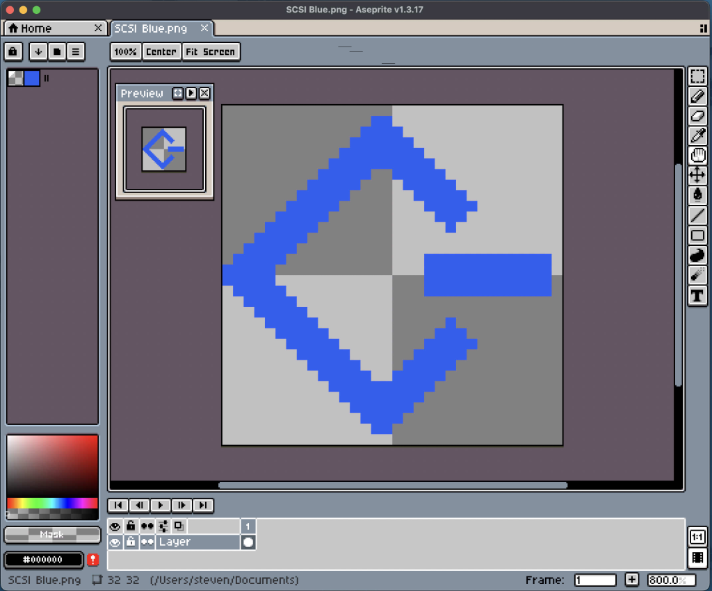
My first digital representations of these icons were done in Aseprite. I knew that Aseprite had a number of handy tools (like mirroring, etc) and assumed after I was done, I could somehow simply export or copy and paste such images into Icon Machine. In addition, Aseprite had various zoom levels and tracing tools, which made things way easier to see and redraw as needed. But before getting too carried away, I decided to make a simple test icon of one of my designs and try to export it.
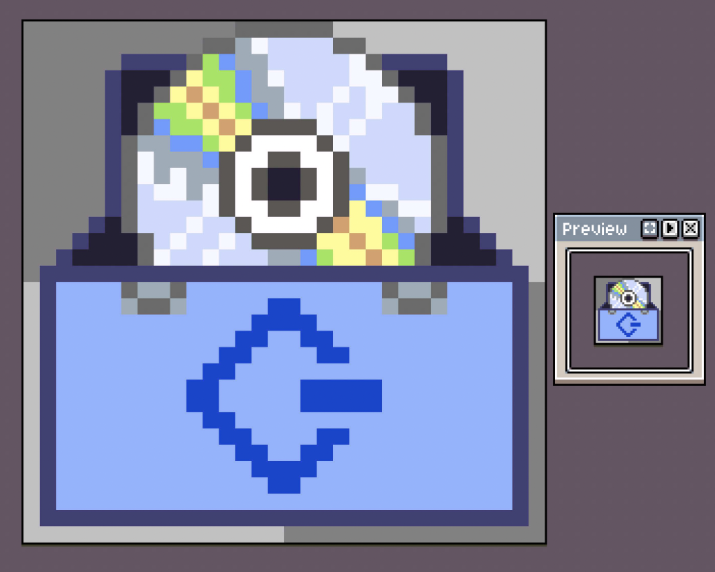
This is where things got interesting… I exported my icons from Aseprite as PNG files and opened them in a Mac OS emulator using GraphicConverter. I tried a few various ways, and was able to successfully export my images from GraphicConverter to Icon Machine. However, the color mode / bits weren’t happy, so the resulting import added a bunch of noise to the icons. This kinda looked neat I guess, but it also just added noise in some cases, making the icons feel different than I wanted. I tried to clean these up in a number of ways, but was unsuccessful at fully removing these anomalies. So instead of battling this, I decided to clean up the icons in Icon Machine, rather than spending time tidying things up in Aseprite, only for me to have to clean them up again later.
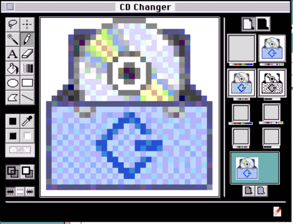
This was easier said than done. Aseprite had various zoom levels, which was great. However, Icon Machine didn’t have as many, requiring me to set my Mac OS emulator to 640×480 and enabling full screen mode to get the largest visual I could on my MacBook’s 14-inch display. Yes, I could have used a real Mac for this, and I tried – but I found myself pushing my face too close to the LCD or CRT. Such a weird posture made my neck and back very unhappy. I found it was far more comfortable to push pixels on my laptop on the couch, which also allowed me to dive back into editing these icons whenever I had a free moment.
During this time life got in the way (as it does), and weeks turned into months and my draft icons sat collecting digital dust. I finally got the time and creative energy to jump back into them to finish them off.
One of the challenging aspects about creating icons like these, is that you’re not just creating one icon and going home. You need to carefully craft 8 different variations of such a design, and it needs to look and feel consistent and appropriate across the board. Now repeat this dance for as many icons as you’re going to create.
Why eight?
Well the classic Macintosh operating system offered icon sizes in two sizes, large (32×32) and small (16×16). However, there were also various color modes, ranging from 32-bit color, to 256 colors, 16 colors and lastly, black & white. In addition, the mask of these icons needed to be correct. Without modifying the mask, the outline or silhouette of an icon (when selected or opened) would look weird or broken. Thankfully Icon Machine provides some great previews (see the right side of the screen below), allowing you to see how things would look depending on the size and color, etc.
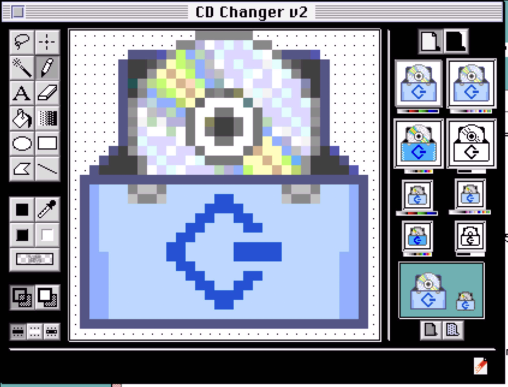
Toolbox Icons 1.0
After a final few days, I was satisfied with what I’m calling “1.0” of this set of icons. I may come back at some point to adjust things, but I’m happy with these and they look great in both sizes and across all four color settings.
These icons are in the latest version (1.1.1) of the Macintosh BlueSCSI Toolbox suite which can be found here: https://bluescsi.com/toolbox
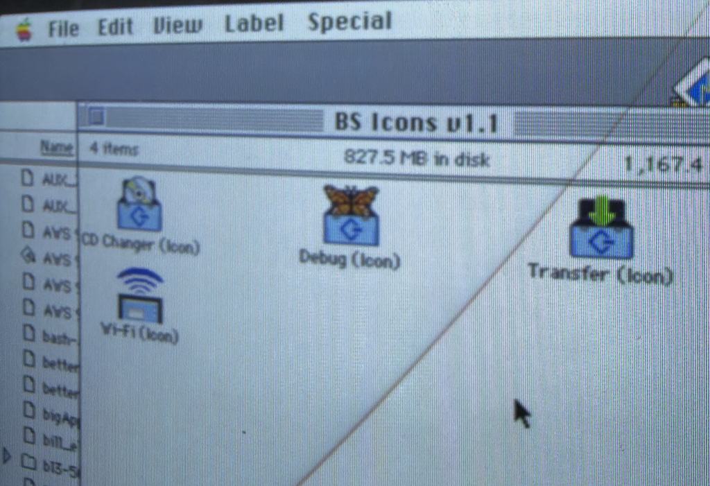
What’s with the Wi-Fi icon?
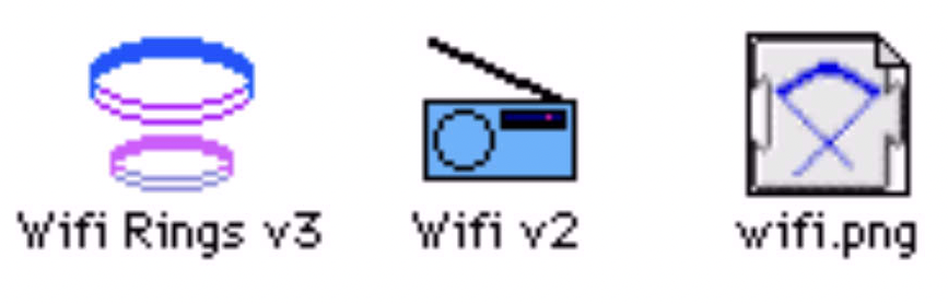
That was just something fun I created. Although Joshua’s BlueSCSI Wi-Fi Desk Accessory app already has an icon (jcs.org/bluescsi), I played around with this as a fun exercise. Looking back at my notes, this started as an extension icon for another Wi-Fi related project. So maybe it’ll be tweaked for that in the future. Since this icon isn’t included as part of the BlueSCSI Toolbox, I’ve made the icon available for download on this TinkerDifferent.com thread in case you want to grab it.

What’s next?
Sadly, being a pixel artist isn’t a suitable job these days. However, I’ll likely create icons now and then when the mood hits me. Like this SyQuest disk icon I’ve been tinkering with. If I create anything I feel worth of sharing, I’ll be sure to share a link on my socials or elsewhere online (like this blog).
Thanks for reading! You can support me on Patreon if you’d like what I do. You can also subscribe to my YouTube Channel for free.